Recent Project
Living Design
Leather Working:
Nickel & Suede HQ
Nickel & Suede has come a long way since founders Kilee and Soren Nickels first started selling handmade earrings out of their unfinished basement. In the span of just five years, the company that started with a single, simple product has grown into an accessories and lifestyle brand employing a team of 30, with plans to expand. After outgrowing their previous space, the top priority for Nickel & Suede’s new headquarters was creating an office that captures the brand’s aesthetic and allows for functional scale alongside the company. We worked with the Nickels to create an office that’s Instagram-worthy and programmed for expansion.
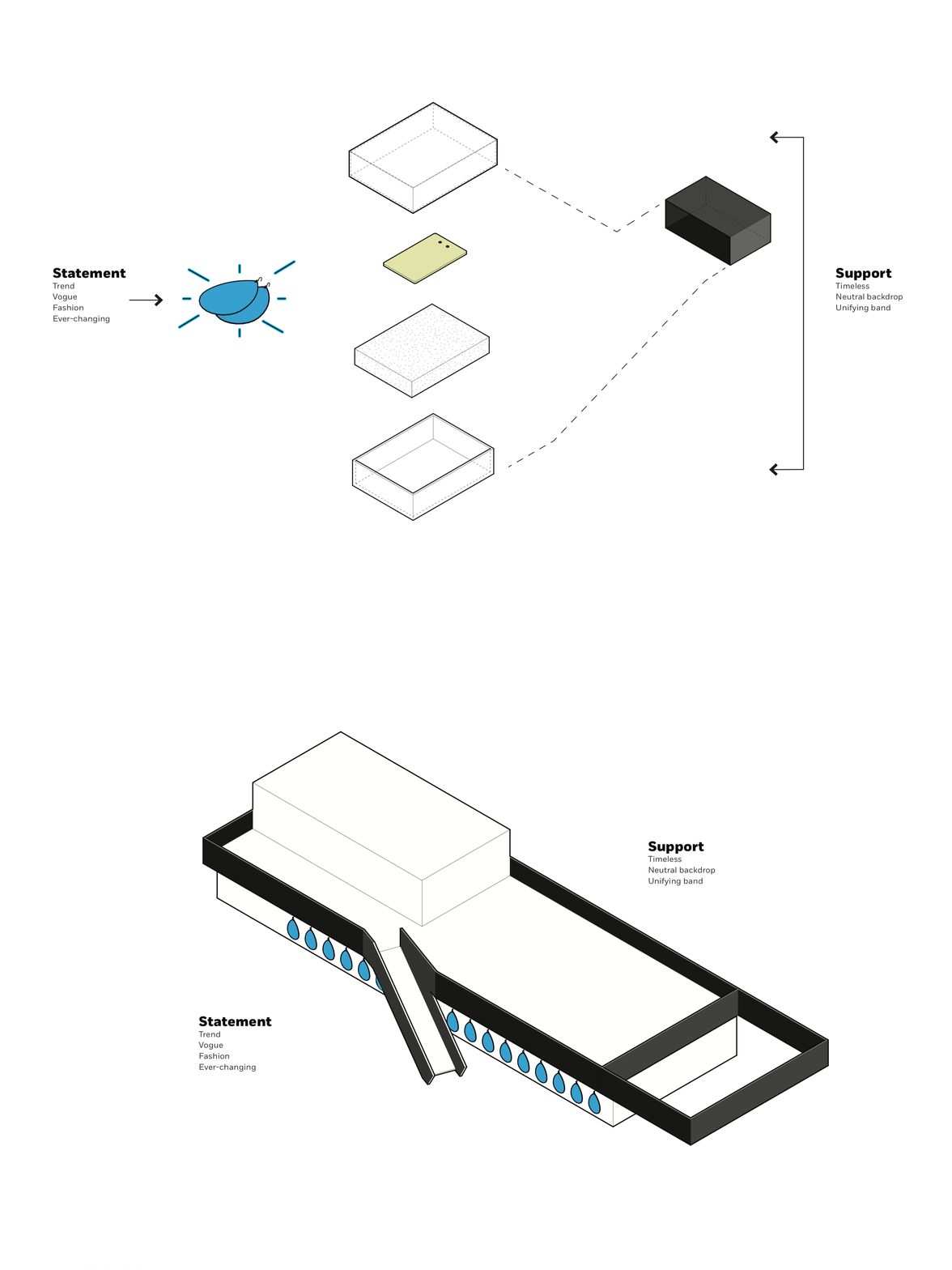
The office design is inspired by the Nickel & Suede “bundle” or standard retail packaging. Support pieces, like the box, soft surfaces and outer ribbon wrap, are timeless, neutral and minimal. These items allow the jewelry, which is more colorful and fashion-forward, to be the statement of the bundle. Business and production spaces are treated as the timeless support elements, while key design moments, like the lobby’s leather wall, are statement features. The stairs are a commanding component, too, and were inspired by the dark, minimal ribbon that wraps each box of jewelry customers purchase.
Collaboration runs deep between the creative, business and production teams. Connectivity between each function was a top priority. Business and retail operations comprise the front half of the main level and are connected to the warehouse and production teams in multiple areas, like the employee lounge. A photography floor provides dedicated space for creating visual content, a major component to Nickel & Suede’s outward marketing. The mezzanine serves as a primary creative and design suite and overlooks production and communal spaces for easy connection.
The office is a careful collection of multiple elements – finished and industrial materials, contrasting structure and subtle reinforcements of the brand. In the large conference room, a custom mural by Meg Biram depicts an abstraction of the letters in the company’s name. The conference room table, fabricated by our shop, follows the shape of Nickel & Suede’s Gem earring. We created multiple other items, as well, including the reception desk and brass rail holding the large leather display. In the bathrooms, a brand moment takes place in the form of custom mirrors that are the same teardrop shape as Nickel & Suede’s most iconic earring – the piece that started it all.
In multiple ways, the Nickel & Suede headquarters follow a similar path as the brand’s story – uncomplicated, timeless and functional, with lasting statements of style.
