Recent Project
Press
Our favorites from 2018
We’re at the end of another year, and we couldn’t be more proud of where 2018 has taken us. This small collection shares some of our favorite projects completed within the last 365 days. To the many clients we’ve worked this past year, and will continue to in 2019, for you we are incredibly grateful.
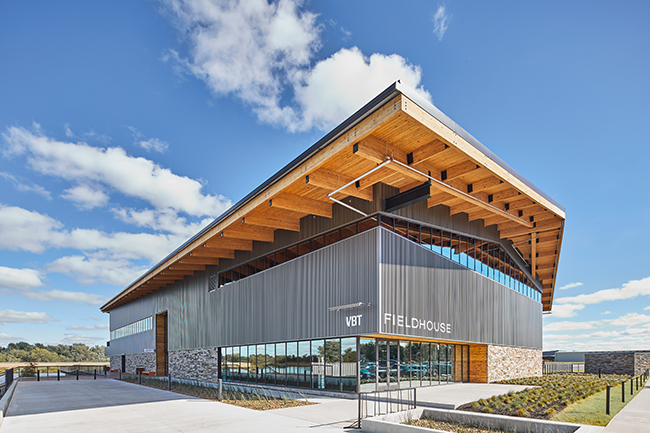
Adjacent to the runway at Thaden Field, the new Fieldhouse is a multi-use aviation center and redefines the “destination airport” experience. The design aims to be a gateway to the Ozarks, and connects street-side users with airfield patrons in a central space aptly named “The Gateway.” Drawing inspiration from the early days of flight in America, and celebrating the legendary career of local aviatrix Louise Thaden, the Fieldhouse embodies the barnstormer era of flight while capturing the unique rural landscape of Arkansas.
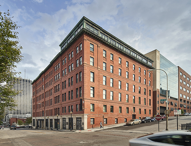
Like a majority of 21c’s properties, the Savoy Hotel building presented an opportunity to restore a piece of Kansas City history and introduce a venue entirely unique to other offerings in the market. The renovation of the existing Savoy Hotel, built in 1888, commanded a delicate balance between introducing more modern amenities in line with a contemporary hotel, and honoring the life and story of its historic spaces and elements. Our team worked in collaboration with design architect Deborah Berke Partners to bring a renewed purpose to this Kansas City icon.
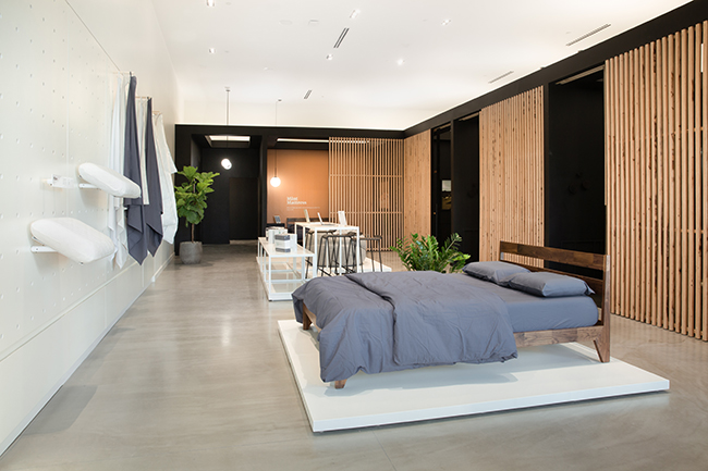
Designed to embrace a home environment and feel more residential than commercial, Tuft & Needle stores are treated like showrooms. The Kansas City location features semi-private “rooms” for customers to peruse and test product. There is no harsh fluorescent lighting, or a sea of mattresses that make customers feel overwhelmed with options. A collaboration between all Hufft studios, Tuft & Needle – Kansas City features numerous custom fabrication pieces, including in-wall rolling casework that serves as both a display system and hidden storage.
Situated above a stream that pumps more than 300,000 gallons of crystal-clear water through its site each day, Streamline House is designed for its local vernacular. Drawing inspiration from the site’s natural stream, the power and elegance of flowing water is celebrated in the transposition of traditional forms. The form of the home is conceptually pushed and carved away by the flow of the site’s runoff making its way toward the stream, and the carves created by the passages of water become special connective moments in the architecture.
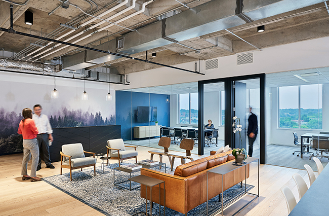
Five Elms is a capital investment firm focused on partnering with software companies that have a high regard for culture. The office design aspired to enhance the traditional idea of a “corner office with a view” by replacing interior walls with frameless glass partitions, carrying the natural light and Plaza views further into the space. Custom furniture pieces designed and produced by our shop can be found throughout the office, including large conference room tables and smaller C-shape pull-up tables in various lounge areas. We also created a mobile reception desk that, when moved, helps transform the entry lobby into a space for hosting social events.
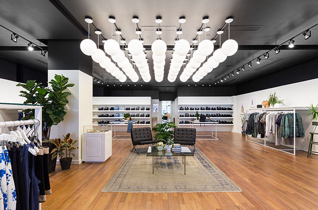
Baldwin Market brings together the BALDWIN and Standard Style brands in one space. The store is a clean and open palette for both brands to coexist. Bright white walls are a neutral backdrop for the product lines to shine, and a dark ceiling caps the interior space. We simplified the layout, adding minimal steel hanging racks and simple floating shelves for product. The focal point of the store is a chandelier composed of a grid of 50 globe lights hanging over a lounge area.
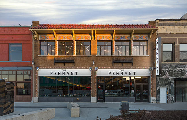
The partners at AIM Strategies saw potential in the historic Pennant Café building in downtown Topeka, Kans. Located just a block from the Capitol, the building is now a hip hot spot that builds on the downtown revitalization efforts underway in Topeka. The design integrates a restaurant, bar, beer garden, bowling alley and arcade into one multi-functional zone. These programmatic zones allow The Pennant to transition from the daytime lunch rush to a bustling happy hour to an energetic evening hang out.
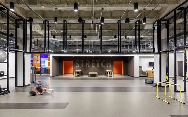
When Auburn University opened a new Recreation & Wellness Center in 2013, no one could have predicted a rise in personal training would result in a shortage of space. Additional and under-utilized square footage beneath the basketball courts sat unfinished but available and was designated the new home for personal training and Olympic lifting amenities, as well as the social facility’s marketing team. Drawing from existing design elements, we worked with Auburn to create a space that enhances students’ fitness experience and expands the Center’s offerings, and what was once a facilities-focused space is now an active part of the campus’s wellness mission.
Parlor is Kansas City’s first food hall, and takes the general concept of the elevated food court trend to the next level. Fitting two full-service bars and seven different restaurant concepts into a single venue required a tactful use of branding and an efficient use space. Each of the two floors play host to a bar and multiple kitchens, with ample dining and hospitality space to cater to a variety of customers. The use of color is playful and energetic, matching Parlor’s quirky brand aesthetic. This project was a collaborative effort between our design and fabrication divisions; the architecture and interior design scope also included FF&E selection as well as accessory styling, and all of the booth seating as well as multiple dining tables were designed and fabricated in house by Hufft.
The Pete is a custom furniture suite designed for a client’s office in a turn-of-the-century arts and crafts home. Natural oak and powder coated steel were used to blend modern and traditional styles. The structure, construction and connections were left exposed to strengthen the relationship of the classic arts and crafts design movement with the home’s surrounding elements.
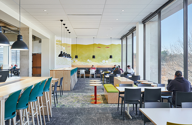
The University of Arkansas’ Student Union Food Court is the primary food service venue on campus. We worked closely with the Student Union and Chartwells, the University’s food service provider, to develop a concept that changed the image of food service on campus. In addition to improving circulation, queuing and modernizing kitchen spaces, the renovation put local, fast and fresh food concepts directly on view, increasing the visibility that patrons have with the food ingredients and preparation. By locating all of the food vendors in a central vendor core, the design creates efficiencies with back of house operations, while simultaneously highlighting the spaces biggest asset – daylight, and views to the surrounding campus and landscape.
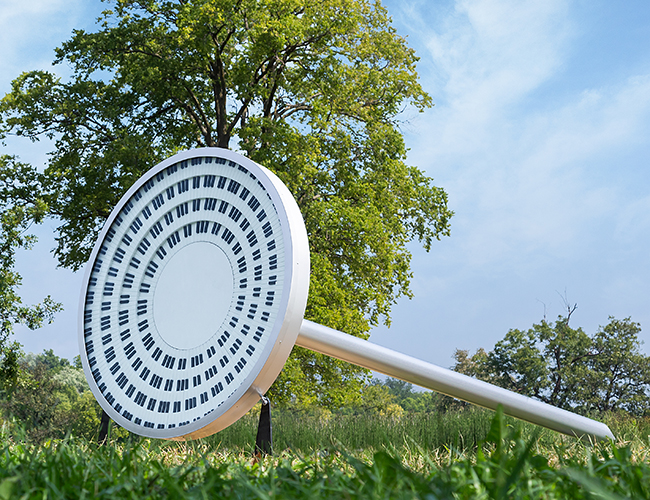
Aside from being an employer for numerous artists, we’ve regularly collaborated with others in the arts community to coordinate, design and/or fabricate artistic installations. In August, our shop had the unique opportunity to partner with exhibiting artists for Kansas City’s inaugural Open Spaces program. We worked with three artists – Alexandre Arrechea, Carlie Trosclair and Shawn Bitters – to fabricate their art installations for Open Spaces.